
Functional Color as an Editorial Tool
Posted on Monday, October 31, 2011 at 10:39 AM
Color is thought to make pages pretty. Using it only as superficial
cosmetic wastes its power. It is not an artistic material, but an
editorial tool whose logical application is controlled by the editor.
Color makes information clear, lucid, fast.
By Jan V. White
One
of the myths of publishing is that "readers" are readers. They start out
as viewers. Searchers who flip, scan, hunt and peck, looking for the
nuggets they want. In a hurry, saturated with "information," and perhaps
a bit lazy, they need to be lured into reading. "Persuaded" might be a
better word, because luring implies bamboozling, and duplicity has no
place in publishing. The least trace of trickery is self-defeating,
because it destroys the potential reader's trust. Persuasion that is
credible exposes the valuable content. Making value accessible makes the
publication useful and liked. Combining accessibility (i.e., making
things easy to find) with speed (i.e., at first glance) makes the
publication a useful, dependable tool.
Where do people begin
reading?
Rarely at the beginning. Usually where something
catches their interest. If there is a picture, the first thing they look
at is the image. A caption, a word, a phrase, a concept, even a title
can catch their eye and fascinate them into paying attention. The trick
is to find the valuable highlights that you know will be helpful to your
audience and deliberately display them. That is how to make publications
helpful and, thus, irresistible.
Don't ever use design to create
prettiness; create only usefulness. Readers want information fast and
clear. I know I am repeating myself here. But the best way to generate
enthusiasm is to make your product easy to slip into, easy to understand
and absorb. Make it clear and simple, and display its usefulness at
first glance. This kind of design is not "art," but clever, canny
editing. Publication design is an integral arm of editing that helps the
editor choose, stress, shout, whisper, point out, expose, explain, and
guide the viewer. Let the content dictate the form. Page design is not
an artform but a lubricant for ideas.
There are no formulas, nor
is there any such thing as "right" or "wrong," "correct" or "incorrect."
Yes, it is confusing and scary, especially if, like many word-people,
you have little expertise in designing. Alas, axioms masquerade as
revealed truths. Pat answers are an easy substitute for analytical
thought. Throw out received wisdom. Instead, look at your product
through the eyes of the aforementioned searchers. Determine what they
need and whether the design works for them. If it works, it is "correct"
even if it is ugly. If it doesn't, then it is "wrong"-even if it looks
gorgeous.
Making things "pleasing to the eye" is a vague will o'
the wisp of false expectations. Don't obfuscate the clarity and thus the
utility of the piece. Visual blandishments can become an obstacle
between the reader and the message. Design misapplied as page decoration
is not only misleading, it is destructive. The medium can steal the
message -- but the message, and only the message, can ever be the
message.
Color helps or hinders
Unfortunately,
color is so beset with silly misunderstandings and imagined magic that
it can become the editor's worst temptation. It is such an alluring
material -- cheerful, different, such fun. Look around at all that stuff
bubbling with visual excitement. What an opportunity to be creative!
That kind of thinking is a trap. The serious publication has no place
for evanescent trendiness. Besides, today's readers are so inundated
with visual excess that color is old hat and flashiness carries little
attraction anymore.
Less is more, but there are no rules, and
each editor stands alone in judgment. Is red better than blue? It
depends on what you are trying to do. Should the background be in color
and the foreground in black, or should the background be in black and
the foreground picked out in color? It depends on what you are trying to
do. Everything always depends on what you are trying to do. Color, like
everything else, should never be based on subjective "liking" but always
on fulfilling specific needs and purposes. (Incidentally, it is
immaterial whether the editor or a professional designer is doing the
design. The judgment and final responsibility falls on the editor.)
What
colors can do
1. Focus attention
Color is different
from black. Because most of the surroundings are usually
black-and-white, anything that departs from the expected attracts
attention to itself. Is that element worthy of the allure color gives
it? Why are headings often colored? They are already different because
of their size and blackness. What quality does color add? Perhaps it
might add value if you-
2. Understand color-keyed associations
If
headings in color show that they are a subset in ranking, quality,
subject, or grouping, then their color is a mark of differentiation.
They remain headings, but color makes them special. But this recognition
only works if you-
3. Establish consistent identity
Apples
are sorted by color at first glance: golden delicious, red delicious,
granny smith. . . Headlines can't be sorted out by red, blue, and green
just for visual exuberance. This would merely confuse. Establish logical
consistency. (Incidentally, black plus three colors is the maximum that
most people can remember as distinguishing characteristics for purposes
of sorting, unless you provide a frequently repeated color key as a
reminder.)
4. Rank value by visual identification
Everyone
understands that bold type screams and tiny type whispers. It ranks
information and attracts attention. Color has a parallel: some hues jump
off the page while others hide. It is not just a question of brightness
("chroma"). Proportions and relationships to surroundings create the
effect of color. A huge blob of bright color repels because it is so
loud. A small spot of the identical hue may be just right. A tiny dab of
a wan color may not be noticed at all, whereas in a large area it may be
perfect as identifying background for a box. Become aware of the
comparative degrees of urgency your colors create, and apply them in
such a way that the viewer is guided by them to understanding the
information in the appropriate sequence.
5. Clarify the
structure
Break long pieces into segments so that they become
less daunting. Use color to subdivide. Print the glossary on blue stock,
the index on green, and the introduction on yellow. What is now left
looks less user-unfriendly. Then give chapter openers all a full spread
and run red full bleed all around. When the document is held in the
hand, the slivers of red are visible on the outer edge. Insist on color
on the edges of both left-hand and right-hand pages so they are
noticeable in both directions.
6. Control color's connotation
Cultural
associations are based on common sense and knowing the culture of the
demographic segment you are reaching. Bananas are yellow, but when
flecked with brown they are ripening, but all-brown bananas are
over-ripe, while black are rotten. A pale-green banana is unripe, a blue
one frozen. A purple banana is a child's version of bananahood. A silver
banana is inedible because it is a piece of sculpture, while a
polka-dotted one is a joke. A red banana is not a banana but a plantain.
Use the color that tells the right story. Don't pick dollar numbers in
red to avoid "being in the red." Green also means "go," amber "caution,"
red "stop." Beware when picking a hue just because you like it.
7.
Fit into the corporate idiom
High-priced designers originally
intended the palette to create a marketing and advertising identity.
Then it was extended to signage, then vehicles, and then someone
remembered print. It is senseless to rail against such restrictions. In
the practical world, it is far better to accept them and work within
them.
8. Give order to information chaos
Does color
explain relationships by the way segments relate to one to another? Does
it analyze data visually so they are obvious to the casual looker? Does
it make lookers interested, involved, and perhaps even compel them to
start reading? Does it help them to understand the information? Does it
enliven the atmosphere of the product while making the information
clearer? Does color add intellectual value?
Result
The
first and most obvious reaction when looking at a page is whether it is
pretty or not, irrespective of whether it works. Color is too often used
for cosmetic purposes. Avoid that trap. Use color to make the ideas on
the pages clear, regardless of its prettiness. If you apply color
functionally, you will discover to your amazement that it is visually
satisfying and perhaps even beautiful. If you pursue clarity, you will
find that beauty is a welcome byproduct.
Now that you've found
the answer, standardize it, because repetition gives clues to viewers.
They learn to react to the elements you are presenting. Repetition also
helps create personality for your product, a vital characteristic in the
marketplace. So don't embroider or make changes for the fun of it
because you fear the viewers will get bored. They won't, because they
don't live with your product as long as you do. Most important, don't
show off or be original for the sake of being original. On the contrary,
guard your precious system carefully against erosion or dilution. None
of this is designing for art's sake.
You need not be afraid of
color. All it does is to exploit the capacity of design to help the
user. As such, it is an integral part of editing for the reader -- the
purpose of our profession.
Color used functionally to discern

In
the above example, the red color makes the ten-ness pop out. If ten-ness
is what you want emphasized, fine! But does the essence of hot-doggery
lie in ten-ness? Nine might be just as good, though more is often
better, so perhaps a dozen might be more impressive. Ten-ness is
significant when compared to other tens, like Commandments, the ten
best-dressed, ten fingers, the ten whatevers. Yes, it does look dramatic
and striking. The question is not whether it looks better, but in
what it leads the viewer to understand. But here, the color is applied
to the wrong thing.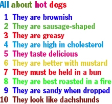
Color
is so much more fun to look at! Doesn't the above look endearing and as
cute as a kid's book? When did you last see a tabulated list of elements
handled in such a cool way? But we could take it further. How about
setting each line in a different typeface as well as in a different
color? Now wouldn't that be creative? Oh, but could we get away
with it? Nobody has ever done it before, so it would certainly make
people notice!
Is that all we want and need? Does it matter
that the form outshouts its message? This format is cute, but
meaningless.
Here,
we have the same words as the two earlier examples - just a list of
characteristics of hot-doggery, but here color is used to emphasize the characteristics
of hot dogs. The list of attributes in red is faster to scan (because
the repeated words of each line can be skipped), so the
less-than-interested reader may be hooked. It is more persuasive,
because it concentrates on service; we've done the thinking for them. The
reader/viewer will appreciate its obvious usefulness and therefore will
"like" our product better. Celebration in Publisherland!
In this illustration, color helps to reveal the point.
Color
used functionally to interpret
This
silly text is written as a straightforward report under a normal title.
When it is finished, the question of color comes up: Where can we add
it? But it is too late to make functional use of color. It can only be
used to dress up the piece, usually by running the title in color --
adding nothing to understanding, emphasis, or interpretation. Blueness
might as well not be there at all, for all the good it does.
The
wording above is identical to the first example, but the key words
denoting the benefits have been emphasized. This is better than the
monotonous, monochromatic version, but it is still hard to scan, and
there is a lot of reading to be done. The visual salesmanship is not as
hard-hitting as the verbal salesmanship of the text. But the blue does
link the headline to the emphasized words.
This
text has been rewritten to allow the six key benefits to be presented as
parallel constructions, each as a separate paragraph. Blue helps the eye
to find the items, aids the mind to recognize the parallel listing, and
clearly ties the benefits to the headline. The verbal and visual
implications reinforce one another. It would be better if a sliver of
white space were inserted between the items.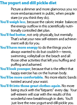
Here
the benefits are exposed as hanging indents, giving them maximal
noticeability. The visual pattern makes the most of the verbal
repetition. Writing, layout, and color have been blended to show off the
"what's in it for me" factor using that magic word, "you."
Dramatically deep indenting uses up more space, but since this version
receives highest readership, that additional space is a good investment.
Jan
White lectures worldwide on the relationship of editing to design. He
tries to persuade word people to think visually and visual people to
think verbally. He is the author of Editing by Design, 3rd Ed,
and a dozen books on publishing techniques. Contact him at janvw2@aol.com.
Add
your comment.
Posted in (RSS)