« July 2017 | Home | September 2017 »

Issue for August 2017

Working with Subheads

Posted on Wednesday, August 30, 2017 at 4:21 PM

The delicate art of designing and placing subheads.

By Nikola Mileta

In a design sense, subheads serve the purpose of breaking up long text blocks. It is important to place them in strategically good spots. I'll offer some tips on how to do that.

The general idea is to break up the text and to give readers some clue what lies in the following paragraphs. Editorially, subheads act as a headline for the upcoming text. Some publications miss this point, and I find myself often reading paragraphs that have no connection with the subhead.

Let's review some of the principles and techniques involved through the use of examples.


Subhead set in bold.


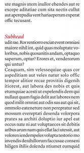
Subhead set in different italics. Be careful with italics because they can look pretty light.


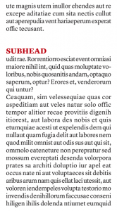
Subhead set in all caps.


Subhead set in different type style. This is the best practice for setting the subheads.


Subhead set in a box, or with underline.


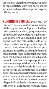
Subhead set in running-in style. Looks really cool, but the text has to have some meaning.

Type Selection in Subheads

When establishing your style for subheads, make it consistent throughout the publication. There are times when you might want something to stand out and be different. But obviously you can't accomplish that without having an established graphic style.

Your subheads should be clearly distinctive from the main body copy. They should be instantly recognizable. You can emphasize them in several ways:

--You can set your subheads in the same typeface as your main copy but use the bold version. To make them even more distinctive, enlarge the subheads a few points. Two or maybe even three points larger works well. Four points would be too large.

--Another option is to keep the same typeface as the body copy but use the italic version. I tend not to use that in my designs because italics tend to look lighter than the normal text font. Bold italics would be a better option.

--The most used option for subheads is to use different type. The most obvious choice is sans serif if you are using serif type for the body copy.

--You can set your subheads in all caps, but I almost never use this method. It can sometimes work. But in many cases it does not, especially if the subhead is long. You don't want to break the flow of the text.


Bad placing of the subheads.

Subhead Tips

Never place subheads three lines or fewer from the bottom of a column or three lines from the top of a column. The biggest mistake I see is placing subheads at the top of a column. That kind of subhead treatment can give the mistaken impression that the subhead is the headline of another story.

Then there is the matter of whether subheads should be one line or two lines. Graphically it is best to maintain consistency; either make them one or two lines. Three rows would be too many. Editors and design staff need to agree on which way to go. Whatever your choice is, make it consistent.

Always position subheads at the top of the next paragraph, not in the middle between paragraphs or just below the previous paragraph.

Whether you use flush-left text or justified copy, align your subheads to the left. Do not center them since that would disrupt the reader's eye flow. Also, do not indent the subhead. The first paragraph below the subhead should not be indented either.

If you want to place a rule with your subhead, place it above. Placement below will break the subhead from its paragraphs below. The best option is not to use rules at all.

A cool way of making subheads, and I like it a lot, is to make so-called "running-in subheads." But your copy editor should start this paragraph with really meaningful words; otherwise there is no point and you cannot call it a subhead. It will only be emphasized words.


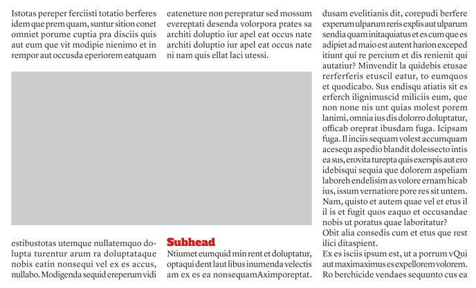
Bad placement of the subhead, just below the image.


Bad placement of the subhead, just above the image.


Bad placement of the subhead, around the runaround image.

Subheads and Images
Do not place the subheads just below an image. Do not place a subhead just above an image either.

If an image is positioned with runaround copy, don't place subheads within runaround text. It will look messy and will create awkward white space around the image.

Nikola Mileta is an internationally noted magazine designer from Zagreb, Croatia, currently living in Beijing. He can be reached at info@magazinedesigning.com.

Add your comment.

Posted in (RSS)

Shifting Responsibility -- Part III

Posted on Wednesday, August 30, 2017 at 4:20 PM

The final parts of my decision-making process.

By Peter P. Jacobi

Last issue I discussed everything from "details of who, why, and what" to the need for educating readers. Here are the concluding considerations:

Elucidation

Explaining in another word, the use of exposition, with which you create full and clear understanding. Don't take too much for granted on what your receiver knows.

Entertainment

That's your job. Make the coverage entertaining, whether the subject matter is serious or humorous, sad or happy, even profound or complicated. Use words and language and facts and approach to give satisfaction.

History

History, like context above. Give your audience, as I try to give mine, enough informational support about what has come in the past that led to what is now.

Impression

For me, the offering of how what I experienced struck me is a critical part of a review. What imprint did the event leave on me? What force? What importance? What sensual leftover? Ask yourself how much of that is necessary as part of your creation.

Institutional Goals

I sometimes need to tell my readers my understanding of concept, the why for what the art or artist or ensemble or musical institution is attempting to do. The arts can be puzzling. The reasons for certain individuals or outfits to exist as presenters/purveyors of new and complicated and even controversial style and content need consideration and coverage in what I write. That may be a need for you, too, in subject fields you cover.

Interpretation

Music requires interpretation; I must pass along my views about artistic choices made and the level of ability and/or wisdom to have accomplished them. Is that a requirement for you? Ask yourself the question.

Intimate Knowledge

As a critic and not really a trained musician, I must continue to study and bone up on matters musical to bring as much background as I possibly can to every assignment I undertake; this is a lifelong responsibility. All journalists, who tend to be, first, generalists, then perhaps specialists -- should do that as well. Be a knowledge seeker. Equip yourself with the fodder of the field.

Judgment

My task as reviewer/critic requires the careful use of judgment, including care and thoughtfulness and fairness and sympathy and definiteness, meaning I must bring logic and feeling and opinion to the written product. Decide whether or not that's part of your final aims.

Narration

Story-telling is always a welcome given. Be able to use story wherever and whenever it is appropriate, as it is very often helpful to make your journalistic product more successful. We grew up with stories. We love stories. Stories are powerful ways to make powerful journalistic pieces. Be as generous as it is right to be by supplying what your audience will like: stories to help you share with strength and attraction what you have to share.

Observation

To be able to describe, to be able to offer meaningful and intriguing detail, to help bring your copy to life, the force of observation must be potent within you. That I find critical for all I cover, whether it is music or anything else; I always seek out the unusual, the unexpected, the small and barely detectable, the juicy. I'm sure that's what you try to do, too.

Opinion

Ultimately, in my job as critic/reviewer, I must offer some sort of opinion and, with it, sufficient support. Not when I write feature stories or news stories, but in reviews, it's a factor that belongs, a part you work toward, a part of the climax.

Reportage

I don't feel comfortable if I haven't done what I believe to be enough gathering of information: the interviewing, the fact finding, the observing and listening, the being there, the participating, if that is called for and possible.

Not all fits in all, of course. But these are elements to consider. And every consideration must take me back to the reader, what his or her wants and needs are likely to be. And that's what I pointed out for Professor Melamed's young music writers (see Part I), and that's what I'm reminding you of. Reminding is always useful for us all. I certainly need it.

Peter P. Jacobi is a Professor Emeritus at Indiana University. He is a writing and editing consultant for numerous associations and magazines, speech coach, and workshop leader for various institutions and corporations. He can be reached at 812-334-0063.

Add your comment.

Posted in (RSS)

The Fog Index

Posted on Wednesday, August 30, 2017 at 4:20 PM

Assessing the readability of a Mashable.com excerpt.

This month's sample comes from an August 29 article on Mashable.com ("Google Is Rolling Out a New Feature on Google Maps That'll Make Parking a Lot Easier" by Colin Daileda). Here's the text we're evaluating:

"Few things make me want to rediscover religion like trying to find parking in New York City. The few times I've driven here, it's been only vaguely irritating until it's time to park, which is when dread seeps through the walls of my skull. So many shiny cars sitting idle, their owners already in post-parking bliss. Fire hydrants open holes of hope only to mock me as I roll past what I thought was an empty space. I rage at cars that could be positioned closer to each other, which would give me maybe enough space to squeeze into a spot. By the end of it all, I find myself praying to the parking gods, please, for a slab of free asphalt."

Word count: 122 words
Average sentence length: 20 words (17, 27, 12, 21, 24, 21)
Words with 3+ syllables: 4 percent (5/122 words)
Fog Index: (20+4)*.4 = 9 (9.6, no rounding)

It's rare that we find a sample whose Fog Index falls in the single digits. The key factor here may be word choice. Even with a longer sample than usual (122 words total), we have only 5 longer words, or 4 percent of the sample text. This balances out the average sentence length of 20, which might have driven the score out of ideal range if paired with more flowery phrasing.

What makes this sample so Fog-free, in the end, is its simplicity. The writer hasn't dumbed anything down or compromised in the name of readability. The sample manages to merge smart commentary with economy of language. Readers don't need to pause to catch their breath between phrases or sentences because the punctuation does so for them. In this regard, this is one of the more textbook examples of Fog-free writing we've found since we started running this monthly column.

Add your comment.

Posted in (RSS)

Nonprofit Journalism

Posted on Wednesday, August 30, 2017 at 4:20 PM

In the news: How one prominent newspaper is tapping into philanthropy to help fund its reporting.

The Guardian is turning to crowdfunding to help offset online profitability shortfalls. Lucia Moses of Digiday.com reports, "The U.K. publisher announced that it's launched a new nonprofit, at theguardian.org, to raise money from people and foundations to support its journalism. The nonprofit has raised $1 million in grants since it was quietly founded late last year."

This is one of several initiatives the Guardian has launched to augment revenue. Others include memberships, reader contributions, and philanthropy, says Moses. The content will remain "editorially independent of its funding source," but relationships with philanthropic groups may present new scheduling and logistical challenges when planning issues. Read more here.

Also Notable

AP Style Changes in Response to Charlottesville

The AP has weighed in on vocabulary surrounding the recent violence in Charlottesville, Virginia. In a recent blog post, AP Vice President for Standards Jon Daniszewski writes, "The events in Charlottesville are an opportunity to take another look at our terminology around 'alt-right' and the way that we describe the various racist, neo-Nazi, white nationalist and white supremacist groups out there." AP is now advising writers and editors to avoid using the terms "alt-right" and "alt-left" unless they're being quoted from elsewhere. It also has differentiated between white nationalists and white supremacists. Read the blog post, which includes a short glossary of redefined terms, here.

Facebook Instant Articles

Facebook is launching a program that will allow publishers to reap subscription revenue through content hosted on the social networking platform. CEO Mark Zuckerberg has indicated that several US and European publishers will test the service later this year, and that participating media companies will keep all of the subscription revenue driven by the site. Read more here.

Add your comment.

Posted in (RSS)

« July 2017 | Top | September 2017 »